GRAPHIC DESIGNING - Shadow Effect In CANVA
Texts on banners of any social media
channels decide to dominate over the other posts through its effect and magic
of shadow.
This magic of shadow attracts more people
to have a look at the post even if the posts are not in the interest category
of that subject.
This makes a lot of difference for any social media channel to grow their
business in a large audience.
This shadow effect on CANVA1is created using a couple of settings on the text written on CANVA. The background color also matters for the text to look out between the banner to explain the things of your subject.
STEP NO - 1
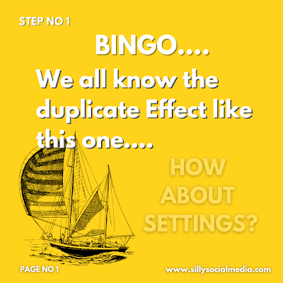
THE DUPLICATE EFFECT
- This must-have tried by almost every CANVA user to make a shadow effect despite the simple settings that are available in the top navigation of the design interface.
- To make a duplicate effect write down the text you want to make a show of like in this Banner written is "BINGO....." "We all know the Duplicate Effect like this One".
- This is the text written on the dark yellow background and make the text color to black or gray.
- Copy-paste the same text again and make the color of this text as white and adjust it besides the black text to make it look like a shadow.
- To make it look like a shadow on the text use the zoom option available at the right bottom of the interface.
- Once adjusting on the black text is completed then select the "fit" option again to get back to the same interface again.
STEP NO - 2
- Write the text that you want to make a shadow effect and choose its color that best suits your background color and fancy font.
- Here in this case I have used white color for text on a dark yellow colored background and "LOVELO" font.
- These are important steps as they might make an effect on the design the good as well as bad and making the right choice comes with a game of practice.
STEP NO - 3
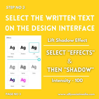
- Select the text on the interface then select "effects" & select "lift shadow", keep the intensity to 50 to 70 or sometimes full depending upon your design and you get to see the magic.
- Select the color of the shadow below to the opposite of the color that you are using for your text.
- Intensity to keep more on the background as such the effect should be noticed by on the banner.
- This effect is more like the shadow that is spread everywhere around & below the text.
- Everything here is about changing the color of text and its shadow with matching the intensity level that makes your design appear the best.
STEP NO - 4
THE SHADOW EFFECT BELOW THE TEXT
- This effect is like the effect we make by duplicating the text which takes a couple of minutes and using the shadow effect it takes a couple of seconds.
- To use this effects select the written text and select "effects" and "shadow" the middle option.
- Here change the color of the shadow to the opposite of the one which you have used here for text.
- For Example, I have used text color as white, so if I use background color as white the design would look blurry and unclear.
- So I use black color as the shadow color, so select the color below the shadow option that makes your design best.
- Select here the intensity of the shadow that plays an important role to make the effect appear on any text.
- Intensity usually depends upon the background and text color geography as is used to make the effect strong on the design.
STEP NO - 5
Besides the various common shadow effects, there are also different types of effects available that one should definitely try on their designs.
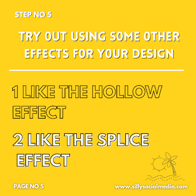
THE HOLLOW EFFECT
One can also select the type of color they want for their text to have with the relevant intensity that makes the best design.
Here there is no extra option present to give for the color as it only makes the text hollow so one has to only select the text color.
THE SPLICE EFFECT
- This effect is more like the hollow effect with extra options present here to change the color between the texts.
- The offset provides an alternative to keep the color away from the text from inside.
- The zero offset fills all the text with the color & with the largest offset selection "100" the color appears 50 % leaving the left side.
- The direction option provides a 360-degree appearance of the color from the text.
- From -180 degrees to + 180 degrees this option provides the color to hang around any direction with the text.
STEP NO - 6 THE ECHO EFFECT
- The word explains more about how this effect will appear on the text as an echo heard from a distance.
- This effect is also available with the color of the "shadow", the direction of the shadow to be rotated within 360 degrees.
- The offset of "0" the echo will not be visible and with the largest offset "100" the greatest size of echo is visible.
THE GLITCH EFFECT
- This is the type of color effect that appears beside the text.
- The offset of "1" the glitch will not be visible and with the largest offset "100" the more color is visible.
- The glitch direction option provides to which angle the glitch appearance should have its presence.
- Two default color options for the glitch are available and only the text color option can be changed as wanted for the design.
THE NEON EFFECT
- The less or one keeps its intensity the darker the shade appears.
- If the intensity is kept the more then the appearance is more bright and the shadow effect is also visible.
- In this case, the intensity kept is around 50 so if the intensity is kept 100 then it more appears like the "lift shadow" effect.
- Here
when the text color is changed, it changes the color of the shadow which we
all usually keep it dark in most cases.
So the Bottom line is:
- The color plays an important part in deciding the effect on the text.
- Intensity & offset plays a more role in how dark and bright the effect will appear in the text.
- The direction option provides 360-degree placement of the effect on the text.


0 Comments
Please do not enter any spam link in here